In some cases (like when using a background image), creating the perfect page for desktop and mobile views can be tough. Taking a background image from desktop to mobile view doesn’t always turn out the way you’d hope. In those instances, we offer the option to create a separate section for each view – one for desktop and one for mobile (and tablets!) This way, you can be sure that your page looks perfect no matter what device it’s being viewed on.
Creating a Mobile Only Section
Here’s how to set up a separate header section for your page’s mobile view:
In the page editor on the left menu, click “Add Content”, then “Add Section”. Choose the section that you think best works for your new mobile section – for mobile header sections, the one with the form is a good option, but you can select any section.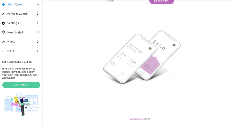
You can also make a copy of any existing section by hovering over the top left corner of the section and selecting the “Copy Section” icon.
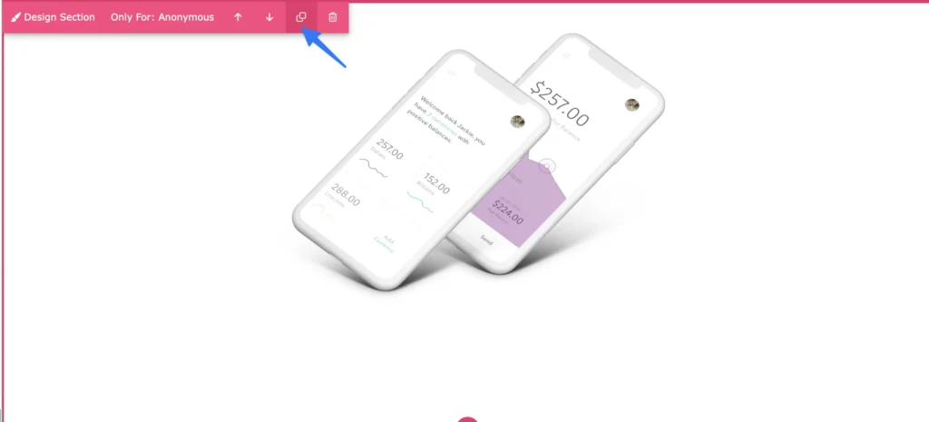
Your new section is automatically placed at the bottom of your page. You can use the arrows to move it up and position it in the order you would like it to appear on the page
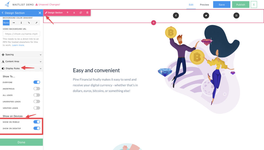
Hover over the top left corner of your new section to access the Device Views menu and hide the new section for Desktop or Mobile viewers
Creating a Mobile Only Snippet
You can now also hide/display snippets within a section. To get started:
Hover over the snippet you’d like to hide/display on a specific device view. 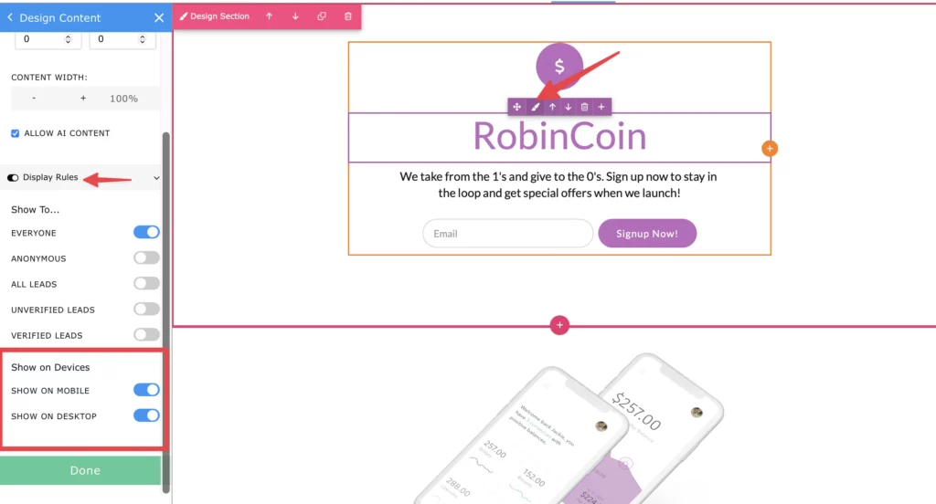
Select the purple paintbrush icon to access the Device Views menu and hide/display the snippet for Desktop or Mobile viewers.
You can also hide/display sections based on specific lead properties. Learn more about the lead property settings here.
Style your new mobile section. You can check the mobile view via the Preview option (top right in the designer>Preview>Mobile). Now you can add your mobile optimized background image to this section for the perfect mobile user experience!
If you’re still having trouble, let us know at support@kickofflabs.com